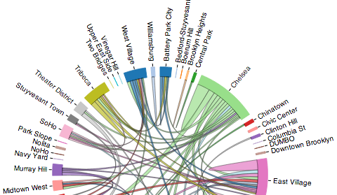
I recently attended the April 2014 #BetaNYC (#BikeNYC) @CitiBikeNYC Hacknight, and after seeing several interesting presentations on what people are doing, want to be doing, and are thinking of doing with the recently released Citi Bike Trip Histories, I was inspired. A few of us got together to ‘quickly’ and ‘easily’ hack together a Sankey diagram of the bike trip flows… Turns out this wasn’t nearly as quick and easy as we though: By the end of the evening, we were still struggling with getting D3js‘s Sankey plugin to play nicely with our data (which I was manipulating in Python using Pandas). I ended up playing around with the data later, and opted to visualize the flows between NYC neighborhoods using a simpler chord diagram.
A chord diagram arranges the nodes (neighborhoods) radially, drawing thick curves between nodes. In my version, the thickness of links between neighborhoods encodes the relative frequency of rides between two neighborhoods: thicker links represent more frequent rides. Only flows that represent more than 1000 trips are represented to avoid too many small flows. Links are directed, and are colored by the more frequent origin (i.e., colored according to where most of the trips originate from). Whereas thecColors themselves are pretty much arbitrary.
The visualization is here, and you can move the slider around to change which year/month is shown. Play around by sliding around and comparing flows over different time periods. Also watch for chord ‘flipping’, where the dominant flow direction changes from month to month. This is particularly common in the smaller flows, where there isn’t a strong dominant direction.
The whole thing was built using D3js and based very heavily on this, this, and this. As I mentioned, the initial visualization was started at the April 2014 #BetaNYC Hacknight, and the version linked here is what I ended up with. Checkout the linked visualization for details on the data sources and the actual code/data used to produce it.